
Thoughts on Typography and Layout
Date
Categories
Editorial
Typesetting
Brief
The brief called for a printed book of four essays chosen from a supplied set, by Josef Müller-Brockmann, Ellen Lupton, Katherine McCoy with David Frej, and Steven Heller. The job spanned the cover, front matter, body and back matter. It ran in two stages. The first was a type specimen poster presenting one body typeface and four display faces, each tested at page scale. The second applied those choices to the full publication, held together by a single grid system. The challenge was keeping dense, theoretical essays easy to read.
Outcome
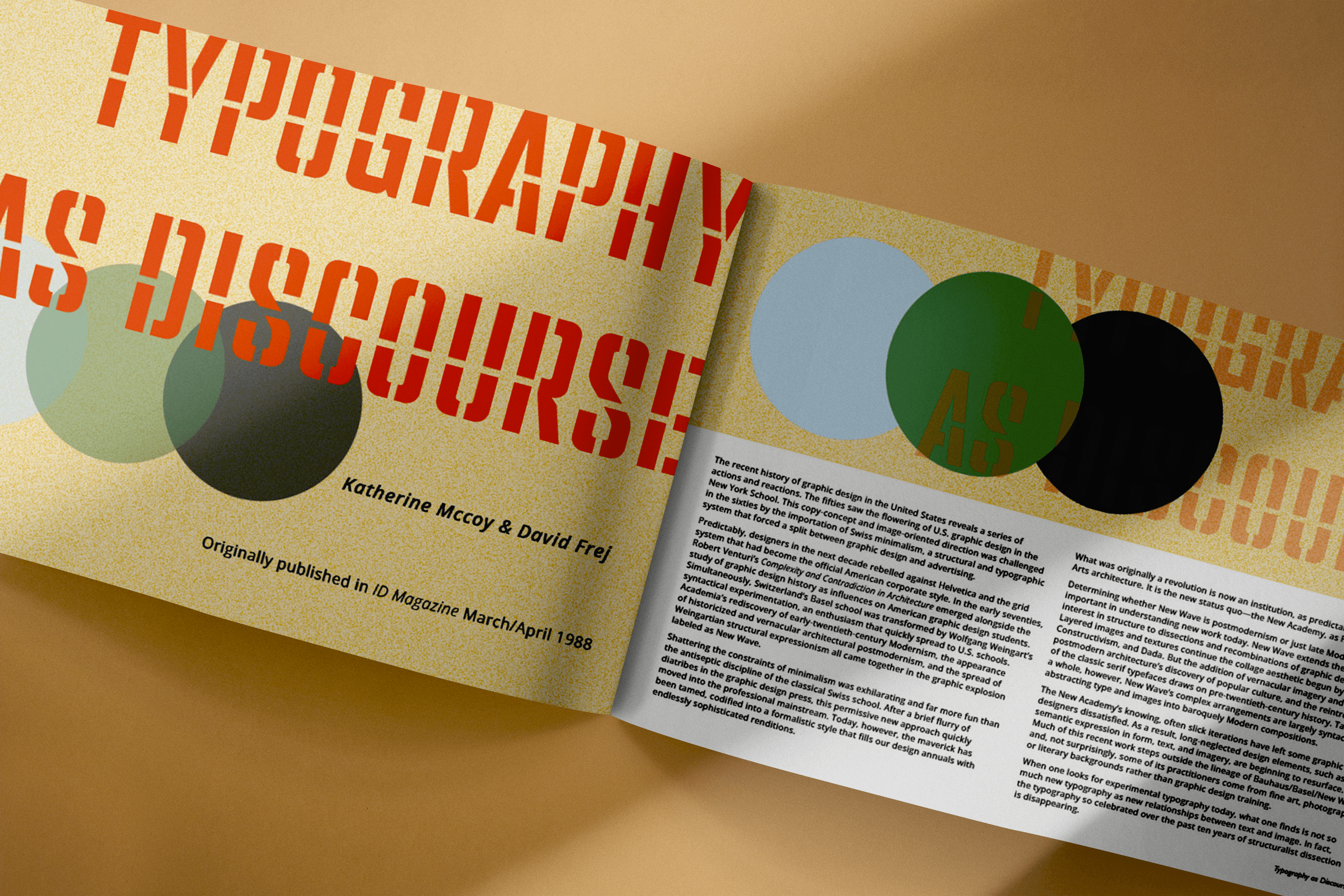
The result is a 20-page collection of the four essays, with three copies printed. Each essay opens with its own display typeface, colourway and graphic: a block of squares for Müller-Brockmann, a DNA strand for Lupton, layered discs for McCoy and Frej, and an oversized “fi” ligature for Heller. The cover and closing pages gather the palette into a cluster of overlapping circles, tying the collection back into one visual system. Each contributor reads as distinct, while the shared body type and grid keep the book whole.
Process
Open Sans was set for the body copy, with its rounded counters and tall x-height. Each essay then took its own display face and colour: Futura PT, Barlow, PF Venue Stencil and Gill Sans. Every page sits on a four-column, two-row grid across A4 landscape, with a 4 mm gutter. Rounded shapes and a bright five-colour palette went into the cover, front and back matter to make the dense readings more inviting. Feedback on the first full draft flagged wrong dashes and apostrophes, missing italics and stray macron characters left by the import. These were corrected, the body text came down to 9 pt and the type was held to the five chosen faces. Final passes worked through each essay to fix bad breaks and widows.


Process
Open Sans was set for the body copy, with its rounded counters and tall x-height. Each essay then took its own display face and colour: Futura PT, Barlow, PF Venue Stencil and Gill Sans. Every page sits on a four-column, two-row grid across A4 landscape, with a 4 mm gutter. Rounded shapes and a bright five-colour palette went into the cover, front and back matter to make the dense readings more inviting. Feedback on the first full draft flagged wrong dashes and apostrophes, missing italics and stray macron characters left by the import. These were corrected, the body text came down to 9 pt and the type was held to the five chosen faces. Final passes worked through each essay to fix bad breaks and widows.
Thoughts on Typography and Layout
Date
Categories
Editorial
Typesetting
Brief
The brief called for a printed book of four essays chosen from a supplied set, by Josef Müller-Brockmann, Ellen Lupton, Katherine McCoy with David Frej, and Steven Heller. The job spanned the cover, front matter, body and back matter. It ran in two stages. The first was a type specimen poster presenting one body typeface and four display faces, each tested at page scale. The second applied those choices to the full publication, held together by a single grid system. The challenge was keeping dense, theoretical essays easy to read.
Outcome
The result is a 20-page collection of the four essays, with three copies printed. Each essay opens with its own display typeface, colourway and graphic: a block of squares for Müller-Brockmann, a DNA strand for Lupton, layered discs for McCoy and Frej, and an oversized “fi” ligature for Heller. The cover and closing pages gather the palette into a cluster of overlapping circles, tying the collection back into one visual system. Each contributor reads as distinct, while the shared body type and grid keep the book whole.
Process
Open Sans was set for the body copy, with its rounded counters and tall x-height. Each essay then took its own display face and colour: Futura PT, Barlow, PF Venue Stencil and Gill Sans. Every page sits on a four-column, two-row grid across A4 landscape, with a 4 mm gutter. Rounded shapes and a bright five-colour palette went into the cover, front and back matter to make the dense readings more inviting. Feedback on the first full draft flagged wrong dashes and apostrophes, missing italics and stray macron characters left by the import. These were corrected, the body text came down to 9 pt and the type was held to the five chosen faces. Final passes worked through each essay to fix bad breaks and widows.
Process
Open Sans was set for the body copy, with its rounded counters and tall x-height. Each essay then took its own display face and colour: Futura PT, Barlow, PF Venue Stencil and Gill Sans. Every page sits on a four-column, two-row grid across A4 landscape, with a 4 mm gutter. Rounded shapes and a bright five-colour palette went into the cover, front and back matter to make the dense readings more inviting. Feedback on the first full draft flagged wrong dashes and apostrophes, missing italics and stray macron characters left by the import. These were corrected, the body text came down to 9 pt and the type was held to the five chosen faces. Final passes worked through each essay to fix bad breaks and widows.


